

Photo by Hush Naidoo Jade Photography on Unsplash
Health Insight Analysis Using Power Bi
Data Analytics Team 4 - Side Hustle Portfolio Boot camp (Week 2)


Yaaaaaaaaaaaaaaaaaaaaay!!! We made it to week two as a proud team.
Week one (1) was quite challenging considering it was an introduction to solving real life problems using data analysis, our challenges ranged from getting used to research techniques used in sourcing for data, brainstorming on raw data before its cleaning, relying on each other as a team for ideas, deciding on which idea forego and which idea to implement in our task.
Week 2 task lived up to its expectations of stepping things up and as you can see in the caption; it’s a health insight analysis using power BI.
Our task for week 2 is "Work on a Health/Disease Insight Analysis. You are to work on any two of the following diseases; Covid-19, Hepatitis, Malaria, Lassa fever, Cholera, or HIV/AIDs. You are to scrap, clean, and visualize data using Power BI and create a Disease and Infection Monitoring Dashboard. Your dashboard must show these data: Infected Demographic by Sex, Infected Demographic by age range, Reported cases by date, affected locations heat map, Mortality by type, Mortality by region, Mortality by sex, Mortality by age range, Mortality rate, total death".
Scrapping Data:
There were new challenges faced in terms of scrapping data this week and they include: the issue of sourcing out data which had incomplete parameters and the brainstorming sessions via merging datasets to achieve a complete data. We would be showing an insight on Covid-19 and HIV/AIDS prior to this week instruction of choosing two diseases.
Covid-19
For the Covid-19 disease; its data was gotten from the World Health Organization Website (WHO Estimates of Excess Mortality Associated with Covid19 Pandemic),this is the link to the data - who.int/data/sets/global-excess-deaths-asso... The data covers the period between 2020 till date.
We also got a live global Covid -19 data that updates automatically every twenty-four (24) hours when online covid19.who.int/WHO-COVID-19-global-data.csv
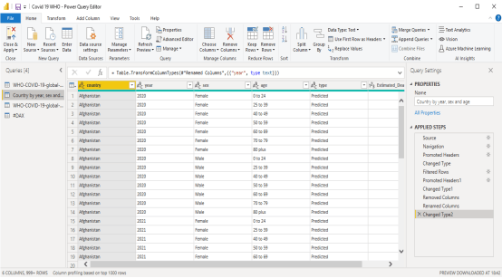
We set out to transform the data to suit the task given
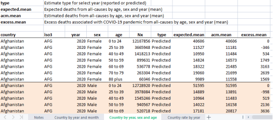
Fig.1 Initial Dataset from WHO data, WHO Estimates of Excess Mortality Associated with Covid19 Pandemic
The data was transformed
- removing unwanted columns like the expected mean, excess mean.
- Renamed some columns, e. g the acm.mean column was renamed estimated deaths in the new tables generated
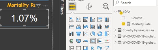
- Mortality rate was calculated using Dax
Visualization
Dashboard Interpretation
First of all, let’s define mortality, since that is our key Parameter. Mortality rate is the number of deaths in a given area or period, or from a particular cause in this case Covid -19.
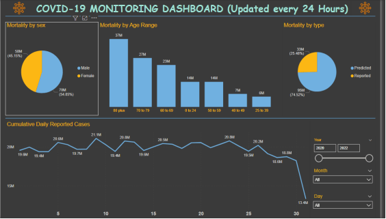
Mortality by Sex
From the visuals it is seen that, the Gender with the higher mortality due to Covid-19 is the Female gender with &0 million deaths (54.85% of the population being affected), while the male gender has lower mortality with 58 million deaths (45.15% of the population being affected). Mortality by age From the visuals, Covid-19 is found to have a higher mortality rate in older age groups than the younger ones, I.e Older people are likely to die if they contact it than younger people. The figures show it all. From the dash board, Age group of 80+ have the highest mortality with 37 million deaths, followed by Age group 70 -79 with 27M deaths. The least beaing Age group 25-29, with the lowest mortality of 6million deaths.
Mortality by type
We have two types: Predicted and Reported cases The dashboard shows that the number of reported cases 33million (25.48% of the population), was far lesser than the number predicted 95 million (74.52% of the population).
Mortality by Region
Highest mortality can be found in South America (2.83265M), followed by Europe (2.090M), followed by (0.79716M) with the least being Africa (0.17450M). Arica had the lowest deaths and South America had the highest
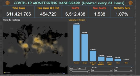
Heat Map
Heatmap is a graphical way to visualize visitor behavior data in the form of hot and cold spots employing color coded systems. It basically visualizes data through coloring. In our visual, the heavy, denser colours shows the areas or regions that are most affected.
As at the time of this documentation, The total cases was 611,421,786 , new cases was 454, 729, Deaths was 6,512,438 and the new deaths 1,538. The data changes every 24 hours as more people in different regions contract the disease daily
HIV/AIDS
The HIV/AIDS disease data was gotten from Kaggle as part of a journal kaggle.com/datasets/programmerrdai/hiv-aids
The HIV/AIDS data went through some processes of cleaning and merge to achieve a full data set needed for the visualizations in our weekly task.
After importing the data from the excel sheet, the data was transformed and loaded into the canvas and the first visuals was the “Infected demographic by sex” which the dataset was achieved by a simple mathematical expression during transformation; this data had only percentage of infected women and thus a simple subtraction of their values from 100 (percentage) gives the percentage of infected men. The visualization was done using a pie chart for easy explanation and understanding. “Infected demographic by age range was visualized using pie chart too and you can use the donut chart too for that. The map visuals in power Bi was needed to represent the heat map of affected areas and the visuals can only be used when you are connected to the internet which we did and represented the infected regions with HIV/AIDS. More visualizations done were on “mortality by region, incidence and prevalence of HIV/AIDS by region and finally reported cases by year which we used two different charts for its visualization. Below are all the visualizations for HIV/AIDS Disease.
THE VISUALIZATION FOR HIV/AIDS
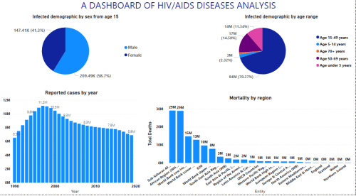
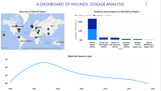
From the Dash board, It shows that the region with the highest occurrence of HIV/AIDS is the Sub Saharan African region with the male having more of the infections 29M. And then from Eastern Mediterranean region to Northern Ireland Having the least occurrence of 0M.
Mortality by sex, shows male with 209.49K (58.7%) having more infections than the women 147.41K (41.3%)
Mortality by Age shows Age <5 years 14M (11.34%) Age 5-14 years 3M(2.32%) Age 15-49 years 84M (70.37%) Age 50-69 years 17M (14.58%) Age 70+ years 2M (1.3%) HIV occurs more in people between ages 15-49 years.
References
WHO, 2022, World Health Organization, 25th September 25, 2022 who.int/data/sets/global-excess-deaths-asso...
WHO, 2022, World Health Organization, 25th September 25, 2022 covid19.who.int/WHO-COVID-19-global-data.csv
Max Roser and Hannah Ritchie, 2018,’HIV/AIDS’, Our World In Data, kaggle.com/datasets/programmerrdai/hiv-aids